
Well the "Entrance Fee" for this years catalogue painting challenge is to paint base and send Curt an "Anti-hero". For doing this Curt will make a small dotation to a charity. So in a way we all come out of it as winners.
But I was struggling to come up with an idea for an anti-hero. I finally looked it up on google and they have a list of fictional anti-heroes. So I picked one I thought I would like to do. And inspired by one of my favourite artists (Gustav Dore) I selected Lucifer from Milton's Paradise Lost.
In the poem Paradise lost Lucifer is a charismatic, sophisticated erudite individual. Who believes that God has favoured mankind over Angel-kind. And as a result leads the angels into rebellion against God.
It was first published in 1667 and follows two story archs, one about Lucifer, the light bearer, and one concerning Adam and Eve.
The figure is part of the "Lucifer's War" range of figures by West Wind Productions. To be honest it is supposed to be Gabriel but I thought it was a better figure than the supposed "Lucifer". I went for the typical black and red as I wanted the figure to be more menacing. If I had settled on white DOVE wings and not CROW wings the figure would look more Angelic in our contemporary view. Likewise If I had selected a blue palette for the clothes that would also look "wrong". So the colour choices were pretty much given to me by our current understanding of who and what devils and angels are.

As a 28mm figure this was a great deal of fun to paint. As mentioned above the colour choices were pretty much preselected so I started with a white undercoat. This was to allow the Red to stand out and not look dull. It did mean that I would have to paint a lot of BLACK though. The wings were painted 3 times with black ink over the white primer in an attempt to get into all the details of the feathers and yet leave the top edges slightly clear of colour. I did not quite work, but It did come close enough.
Other then the cloak the hair and the wings nearly everything else was metallic. So I used both gold and silver to offer some variation. I usually have problems painting gold but have found "ARMY PAINTER" to do an acceptable version of the colour I wanted. I did a top highlight after all other painting was finished with WH SMITHS poster paint gold as it is brighter and sharper. The problem with poster is if it gets wet again it is likely to run into any recesses. But as I was to top coat it all with thin coats of spray varnish I was happy (ok nervous) to risk it. For the silver I started with "Boltgun Metal" and added layers of Mithril Silver mixed in larger and larger amounts with the afore mentioned Boltgun metal and Highlighted with the silver again at the last.. Which is my normal way of doing steel.

The model came on it's own octagonal slotta base. But the pose it was very leaning forward and standing on a pebble. So I got rid of the pebble with some snippers and went into the garden and selected a flint of about the right size and dimensions. The flint was a food fit so I added cork chips around the base and painted the whole lot a random muddy brown. Added white to the mix and dry brushed to make the rocks look weathered. The figure fit the flit with no work at all, sometime I just get lucky so I superglued and green stuffed it in place and to hold it strong. And the jobs a goodun!
And below is Gustav Dore's Illustration of Lucifer from Paradise Lost. he looks far more thoughtful than the miniature which goes to show his many and complex sides.
That's all folks. Thanks for looking and take care. I hope to see you visit again soon. All the best Clint.
 2 more figures done for Matt. No I do not know what they are or by whom they were produced. I am sure I could do an internet search and find they. But I am in a Lack-sid-asicle mood so I have not done so. Sorr just some days you just cannot be bothered. And Today is that day!
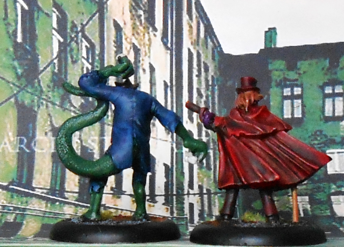 Fun to paint for a change, but I will say no more about them.


